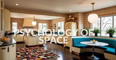
- Beyond Aesthetics Playbook
- Posts
- Inspire Your Home with Cinematic Style
Inspire Your Home with Cinematic Style
Find out how film production design and mise-en-scène film techniques can inspire your interior spaces.
Kaleidoscope Living
March 20, 2025 • Estimated Reading Time: 14 minutes


Everything you see in a movie is a carefully curated narrative that supports the film's storyline. We can arrange our interior spaces similarly to tell a particular story about ourselves.
In today's newsletter, we'll consider a production design technique called mise-en-scène. It is the art of arranging the film set with props, lighting, and costumes to support a film's story and evoke certain emotions from the viewers.
We'll also discuss how you can use this technique to design our interior spaces and create experiences. If you are looking for fresh ideas or wondering how to replicate a scene from your favourite show, keep reading!
Creating impactful visual imagery with mise-en-scène
Mise-en-scène is a French term that generally means setting the stage. Staging in film includes the constructed set or location, props, lighting, costumes, and composition - the arrangement of everything in the frame.
All these aspects contribute to production design and help us understand the story and emotional tone of the film.
Let us look at some films that use these elements to achieve mise-en-scène. We will discuss each film and then see what lessons we can take for our interior spaces.
Colour
Colour is a powerful visual tool that designers use to create the mood and tone of a space or film. A bright and pastel palette can show a playful, light world, while dark colours create tension or mystery.
The Grand Budapest Hotel is a perfect example of how production designers use colour masterfully to enhance the film's narrative, mood, and storytelling. The film follows the adventures of Monsieur Gustave, a charismatic and meticulous concierge, and his loyal lobby boy, Zero.
They become embroiled in the theft of a priceless painting and a battle over a vast family fortune, all set against the backdrop of a changing Europe.
The film is a whimsical blend of humour, romance, and melancholy, complemented by Wes Anderson's trademark visual style of symmetry and vibrant colour palettes. Here is how the designers use colour to shape our emotional connection to the story.
Colour coding to differentiate eras
The film takes place across different periods and it uses distinct colour schemes to differentiate them. For example, the 1930s scenes are imbued with rich, vibrant hues like pinks, purples, and reds, reflecting the grandeur and whimsy of the era.
In contrast, the 1960s scenes feature a more subdued, muted palette, evoking nostalgia and the fading glory of the hotel's heyday.
Symbolism
The bright pinks and baby blues symbolize the elegance of a bygone era, while the darker, muted shades hint at the encroaching darkness of war and change. This balance of light and dark mirrors the balance of comedy and tragedy in the narrative.
Characterization
The colour palette also represents the personalities of the main characters. The candy-pink hotel visually reflects the larger-than-life Monsieur Gustave. Similarly, the deep purple uniforms worn by Gustave and Zero inspire confidence and reliability, reinforcing their roles in the movie.
Mood and atmosphere
The film shifts between colour palettes to evoke various emotions as the story moves through humour, romance, and action. Reds and oranges bring comfort, intimacy and laughter, while cooler tones like blues and greys create tension, uncertainty, and melancholy.
The film's intricate use of colour is more than aesthetic. It’s a storytelling tool that immerses the audience in the narrative. Here are some tips on using colour techniques in our interior spaces to enhance storytelling and personality.
Layer colour palettes to define the mood and activities in each space. For example, warm, vibrant tones like pinks, reds, and purples can evoke energy and fun in social areas. Softer or muted shades, such as pastels, create a sense of peace and relaxation in personal spaces like bedrooms and bathrooms.
Contrast colours to create character and depth in your spaces. For example, highlight unique features with a bold and contrasting colour. It can make your space visually interesting, yet cohesive.
Lighting
Lighting defines how we see a scene. Soft lighting can make a scene feel gentle, while harsh, bright lighting can add drama. Shadows can make us think there is something hidden.
Movies Stanley Kubrick's Barry Lyndon (natural candlelit interiors) and Alfonso Cuarón's Roma (monochrome lighting), demonstrate the power of light in storytelling.
But one of the most celebrated examples of light in mise-en-scène is Blade Runner (1982), directed by Ridley Scott. The film is a cult classic that masterfully uses light and shadow to create its iconic dystopian atmosphere.
Neon lights, reflections, and chiaroscuro (the interplay of light and dark) are employed to evoke a sense of mystery and tension, while also emphasizing the themes of identity and humanity.
While the lighting design enhances the visual storytelling, it also immerses the audience in the gritty, futuristic world of the film. Here are some ways lighting shapes cinematic storytelling.
Atmosphere and world-building
The interplay of light and darkness creates a gritty, futuristic Los Angeles that feels both vibrant and oppressive. The glowing neon signs and light beams cutting through the darkness symbolize artificiality, a core theme of the film.
Chiaroscuro
Inspired by film noir, Blade Runner uses dramatic contrasts between light and shadow to create tension and intrigue. This technique adds depth to the visuals while emphasizing the moral ambiguity of its characters and the blurred line between human and replicant.
Character framing
The production design often isolates characters in pools of light or encases them in shadow to reflect their inner states. For example, Deckard (Harrison Ford) is often lit to highlight his isolation, while replicants are bathed in sharp, reflective light, symbolizing their manufactured nature and emotional complexities.
Emotional resonance
Light spectrums are used to convey mood shifts. Scenes with warmer, softer lighting (e.g., Rachel and Deckard's interaction) create intimacy, contrasting with colder, stark lighting in moments of existential dread or danger.
Drawing inspiration from these lighting techniques, you can create a striking and immersive mise-en-scène in your home with some clever adaptations. Here's how:
Low-key lighting
Blade Runner uses high-contrast lighting with deep shadows to create a moody, mysterious atmosphere. To replicate this, experiment with dimmer switches and directional lighting. Avoid overly bright or uniform light and consider a few light sources to highlight specific areas or objects.
Coloured lighting
The film prominently features neon-like hues, especially cool blues and deep reds, juxtaposed with warmer tones like amber. To introduce these colours into your space, use LED light strips, smart bulbs, or gel-filtered lamps. For example, place a soft blue light near a window and a warm red lamp in a corner to create that cyberpunk duality.
Layered lighting
Combine different light levels and sources for depth. Think desk lamps, floor lamps, picture lamps, and subtle overhead lighting to mimic the multi-dimensional feel of the film’s cityscapes.
Silhouettes and shadows
Position light sources to cast intriguing shadows on walls or surfaces, creating a dynamic interplay between light and dark. Experiment with textured materials, plants, or slatted panels to enhance the silhouette effects.
Composition
The way things are arranged matters a lot in movies. This is true in your home as well. Think of your space as a scene in your film. Look at how you have arranged your furniture, fixtures, colour, and decor items, every item in its place.
Do they support your narrative, or do they clash? Do you have focal points that guide the viewer's eyes to create depth and meaning? Citizen Kane (1941), directed by Orson Welles is a masterclass in composition.
This black-and-white film is renowned for its innovative use of deep focus, symmetry, lighting, and framing. For instance, the cinematography uses deep focus to keep objects in both the foreground and background sharply in focus, allowing complex storytelling within a single frame.
Carefully balanced compositions emphasize power dynamics, isolation, and emotional tension.
Other films that showcase remarkable mise-en-scène include Stanley Kubrick’s Barry Lyndon (1975), which uses painterly framing inspired by 18th-century art, and Wes Anderson’s The Grand Budapest Hotel (2014), celebrated for its symmetry, colour palette, and detailed set design.
Adapting composition techniques from film into interior design can be an exciting way to create visually compelling spaces. Here's how some of these cinematic approaches can inspire your interior design projects:
Layering
Citizen Kane uses a cinematic technique to keep objects in the foreground and background in sharp focus to evoke emotional responses. In interior design, we use layering to draw the eye through the space.
For example, a coffee table in the foreground, a sofa in the middle ground, and an interesting art piece or wall feature in the background.
Symmetry and balance
Symmetrical compositions create harmony and order. They can also emphasize power dynamics and tension. To balance symmetry, designers use colour and texture to soften the composition and add comfort or cosiness to a residential space.
Chiaroscuro
Light and shadow are used to set a particular mood or to emphasize areas on the set or aspects of the characters. In interior design, light creates depth and interest in the space, apart from illumination.
Colour and emotion
The Grand Budapest Hotel is notable for its bold and intentional colour palette. Pick a cohesive colour scheme that defines the room's character, like pastel hues for whimsical charm, bold colours for maximalism, or muted tones for sophistication. Accent pieces in contrasting colours can provide striking focal points.
Composition is about guiding the viewer's eye to experience the space with the intended purpose and meaning.
Texture
Texture adds depth and detail to a space and small details like worn-out cushions or shiny surfaces can tell a story. A film that best illustrates texture in mise-en-scène is Pan’s Labyrinth (2006), directed by Guillermo del Toro.
From the rough, cracked surfaces of the labyrinth’s ancient stones to the ornate, decaying textures of the Faun’s world, the film employs texture to evoke a sense of wonder and unease.
Another great example is Blade Runner 2049 (2017), directed by Denis Villeneuve, where textures play a key role in creating a dystopian, cyberpunk aesthetic.
The contrast between the sleek, futuristic technology and the gritty, decayed urban landscapes adds depth and nuance to the film's atmosphere.
Here are some film-inspired techniques you can adapt to incorporate texture into your space.
Layered materials
Use materials with distinct and contrasting textures to create a layered, tactile environment. For instance, you can combine rough, natural elements like exposed stone or weathered wood with softer materials like velvet or linen.
Also, incorporate intricate carvings, embossed designs, or handcrafted furniture to add detailed textures to your space. Look for unique items that have a story. An old book, a handmade vase, or art can add character to your room.
Aged and distressed finishes
Echo the aged, mysterious feel of Pan’s Labyrinth with distressed finishes. This could include:
- Vintage-style furniture with worn edges.
- Oxidized or patinated metals for light fixtures or hardware.
- Crackled or textured wall treatments to mimic the ancient, timeworn ambience.
Contrast of smooth and rough surfaces
Play with contrasting textures to emulate the juxtaposition of futuristic and decayed aesthetics. Use smooth, reflective surfaces like glass, metal, or polished concrete alongside raw, industrial materials such as exposed brick, aged wood, or raw textiles.
Add metallic accents in warm golds or cool silvers to balance the rustic textures with a touch of modernity.
These techniques can bring a cinematic richness to your interior spaces, making them feel both immersive and unique.
Theme
A theme is an overarching concept or style that guides the aesthetic and functional choices for a space. It serves as a unifying idea that brings elements like colour, furniture, decor, materials, and layout together to create a harmonious and intentional design.
Whether it is film, fashion, photography, architecture, or interior design, a theme ensures that all design elements complement one another. It helps set the tone, creating a specific mood or narrative.
Period films and shows like Downton Abbey are excellent examples of how theme guides the choice of elements, location, costume, and set design. Themes are visual representations of the narrative.
In Downton Abbey, the designers use period design items that reflect the era and the ideas of class, tradition, and social change in the early 20th century.
Similarly, we use themes in interior design to ensure our design choices align with the central vision. This can be minimalism, mid-century modern, Art Deco, Boho, maximalism, or whichever style we choose.
The key components of any theme include:
Colour
Themes often include a specific set of colours that tie the space together. For example, neutrals for minimalist styles and pastels for coastal interiors.
In Downton Abbey, the production design uses rich creams, burgundy, and gold to exude grandeur in the aristocratic spaces. Comparatively, they use an off-white wash in the servants' spaces to highlight the class disparity of the time.
Furniture
Furniture in Downton Abbey serves two purposes. One is to highlight the wealth and societal hierarchy of the characters. The second purpose is to emphasize the tension between the aristocracy's ties to the tradition of social disparities and modernity.
This visual contrast between people with opulent and utilitarian furniture sets highlights the interplay between the social classes, a central theme of the show. It also captures the era's historical context of shifting social dynamics.
Decor and accessories
The show is set in the early 20th century and heavily draws on the design styles of the period. The aristocratic spaces (like the drawing rooms, dining hall, and bedrooms) are lavishly decorated, showcasing the wealth of the Crawley family.
The use of heavy drapery, elaborate mouldings, and ornate furniture reflects the grandeur of the period. As the show progresses, they introduce elements like electric lamps and Art Deco motifs to symbolize the encroaching influence of modernity.
Furniture acts as the anchor of a design theme, both visually and practically. So choose pieces that resonate with your theme to ensure a cohesive narrative.
Bringing it all together
Film production design and interior design share many ideas, such as space, colour, light, and detail. In movies, these elements support the narrative and immerse the viewers in their world. At home, they reflect our personal stories.
The mise-en-scene techniques used in film can inspire us to imagine our spaces creatively. Think of it as creating a movie set and every item you choose is a visual representation of the story you are telling.
I hope this newsletter has given you some new ideas. Think of each room as a scene in the movie of your life and have fun creating your masterpiece. If you would like to discuss how we can help you achieve that, I encourage you to schedule a FREE online consultation with me here.
Catch up with our latest blogs
Thanks for reading!
We’d love to hear from you. Please share your feedback, thoughts and suggestions by replying to this email.
If you are considering an interior design project, I’m offering a FREE 30-minute online consultation throughout January. Book your meeting here.
We are working to grow our reach. Please consider subscribing here and sharing this newsletter with your networks.
Stay inspired!
Reply